
Overview
The Problem
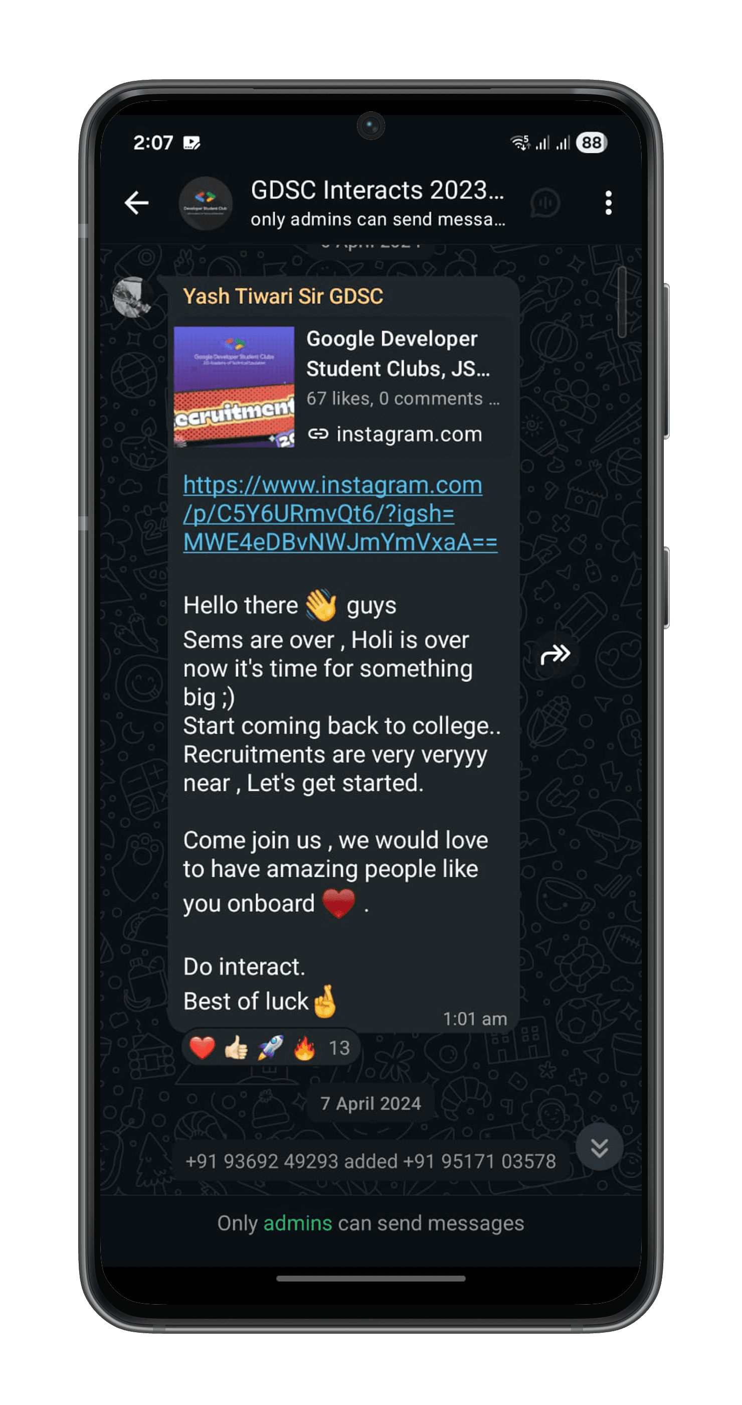
For Students
⚡
No single platform and unified process.
⚡
Have to open Instagram again and again.
⚡
Too many links to open.
⚡
Chance of missing important info.
⚡
Scattered information leading to missed announcements.
⚡
Lack of clarity in application status and progress updates.
⚡
Problem arises if wrong credentials/email used.
⚡
Aptitude platforms don't work sometimes.
For Recruiters
⚡
Registration links need to be shared manually.
⚡
Have to send individually the messages and mails.
⚡
Have to make various forms in different platforms.
⚡
Resumes are difficult to go through.
⚡
Doubts resolved through WhatsApp, which caused confusion.
⚡
Interview day mismanagement.
⚡
Unavailability of 4th years for HR rounds.
⚡
Difficult to navigate through different links of same candidate.
Understanding the Users

Designing the New Journey


⚡
High cognitive load (too many platforms to remember)
⚡
Low clarity (no single source of truth)
⚡
Low motivation & interest (students dropped off due to complexity)
⚡
High friction (too many steps, too many apps)
⚡
Unpredictability (no clear timeline or guided flow)
⚡
It was clear that the experience needed to shift from scattered and overwhelming → to guided, structured, and easy to follow.
User Flow

Wireframes


Key Design Decisions
Students can view and update their personal details, resume, and submission links in one place — ensuring recruiters get complete and accurate information.
This page also shows profile completion status, encouraging students to finish their details before applying, which improves data quality for recruiters.



Recruiter-Side Decisions

Impact
Reflection & Learnings
⚡
Real user insights directed the design - not assumptions.
⚡
Structuring the whole journey improved clarity more than just improving screens.
⚡
Collaboration and quick iterations helped deliver a better product faster.